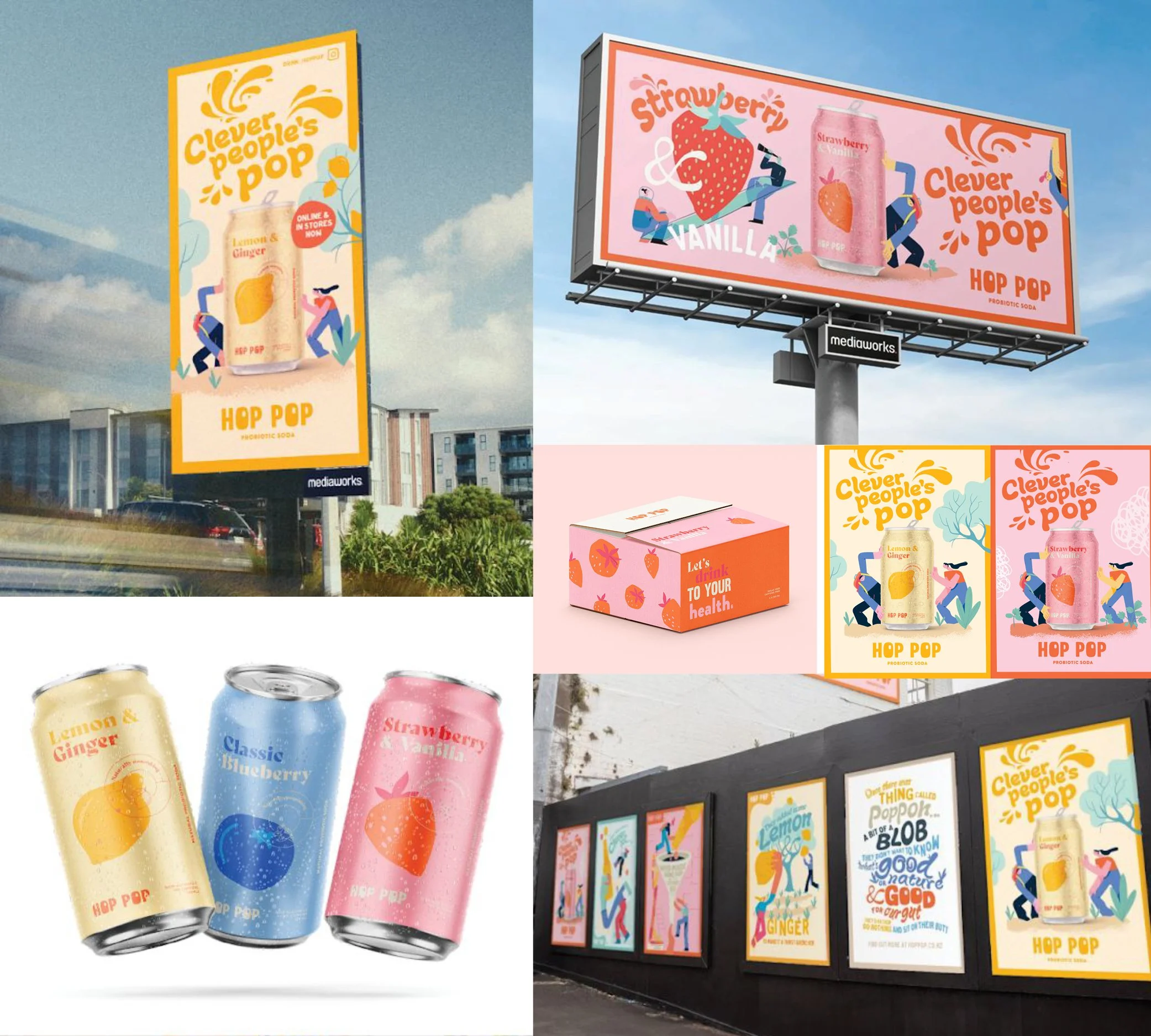
Hop Pop Probiotic Soda
Hop Pop needed to enter one of the most crowded shelves in retail
and immediately feel like it belonged nowhere else. I built the brand from the ground up — strategy, creative territory, packaging and can design — creating a vibrant, character-led world rich in colour and personality that brought the unique evolution story of Hop Pop
to life.
From there, the brand launched hard. A full above-the-line campaign spanning radio, OOH and digital drove mass awareness and gave Hop Pop the cultural cut-through a challenger brand needs to actually be remembered.
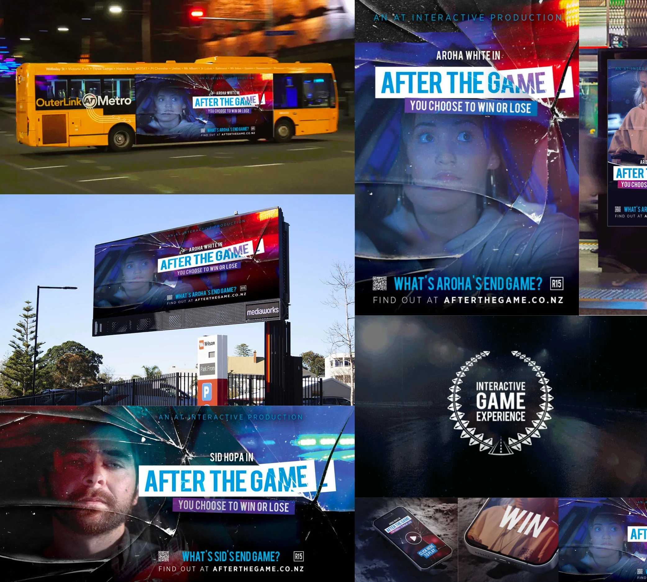
Auckland Transport
Road safety campaigns have a sameness problem. Auckland Transport needed something that people would actually stop for, and "After the Game" delivered it.
I led the visual strategy across OOH, digital and video, treating the launch like a drama series, not a public safety message. Movie poster aesthetics, cinematic trailers, and two compelling characters gave the audience a story worth following. Glass shard imagery created an immediate visual shorthand for consequence without spelling it out. Bold enough to stop people on a platform. Different enough to actually land.
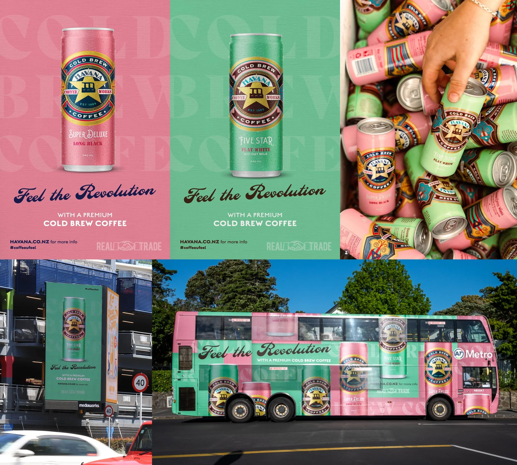
Havana Coffee
Havana had something the energy drink aisle didn't: real coffee, real flavour, and a brand with genuine rebellious soul. The cold brew launch needed to feel like a movement, not a product release.
"Feel the revolution" became the rallying cry - a campaign that leaned hard into Havana's confident, bold brand voice and positioned cold brew in a can as the answer to a generation tired of sugar-loaded energy drinks. Energetic creative celebrated the flavour combinations while the tone stayed true to what Havana has always been: authentic, unapologetic, and a little bit dangerous. A revolution in
a can.
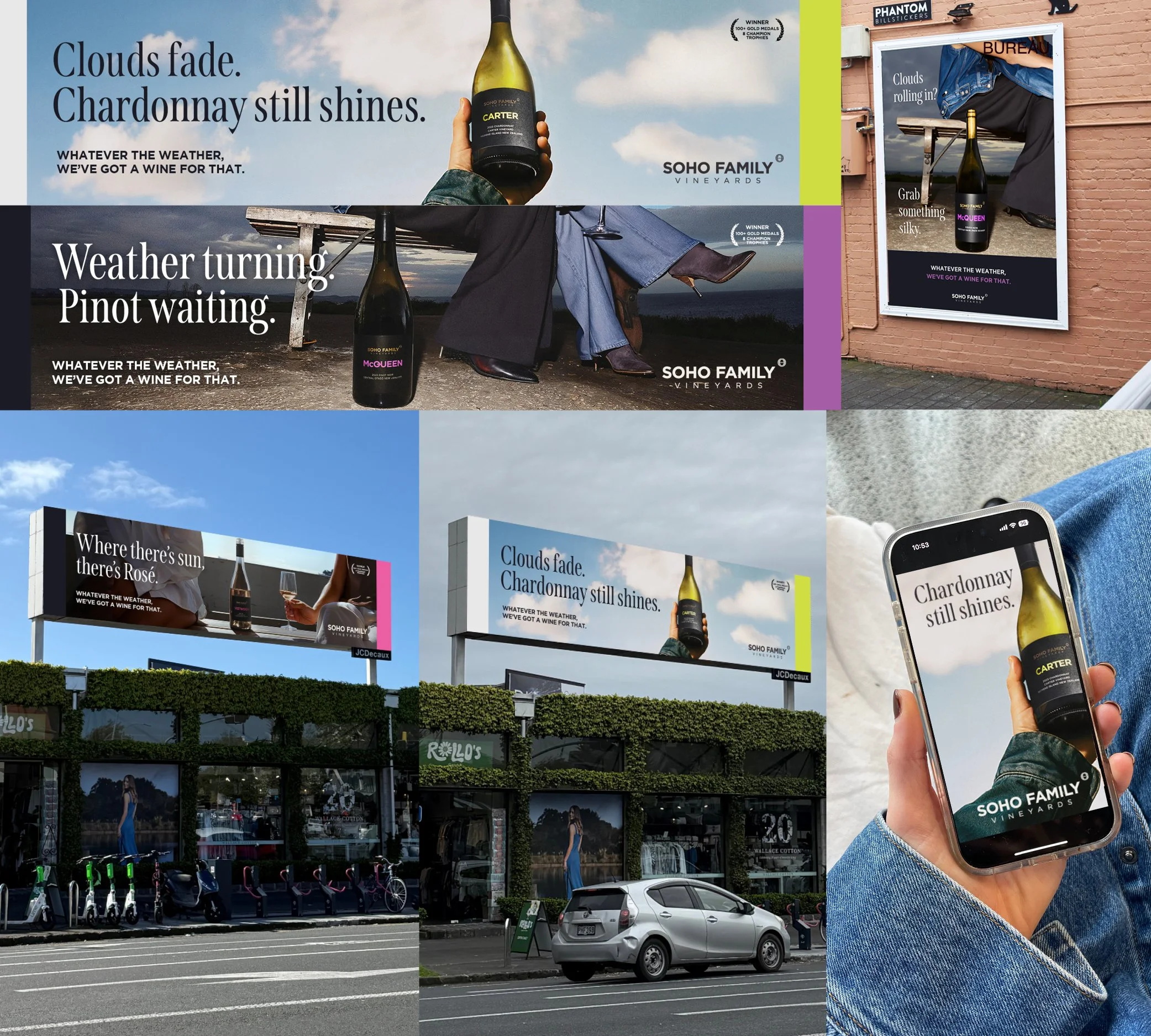
Soho Family Vineyards
Auckland's weather is famously unpredictable. We made that the campaign. For Soho Family Vineyards I mapped each varietal to a weather condition — sun calls for Rosé, clouds mean Chardonnay,
rain is Pinot - then used real-time APIs and geotargeting to serve dynamic creative that reacted to the forecast, not a media schedule.
Soho bottles were shot in-studio and dropped into AI-generated, weather-responsive environments. The result was a programmatic OOH campaign that changed with the sky - playful, tech-forward, and impossible to ignore without a single dollar of traditional
media spend.
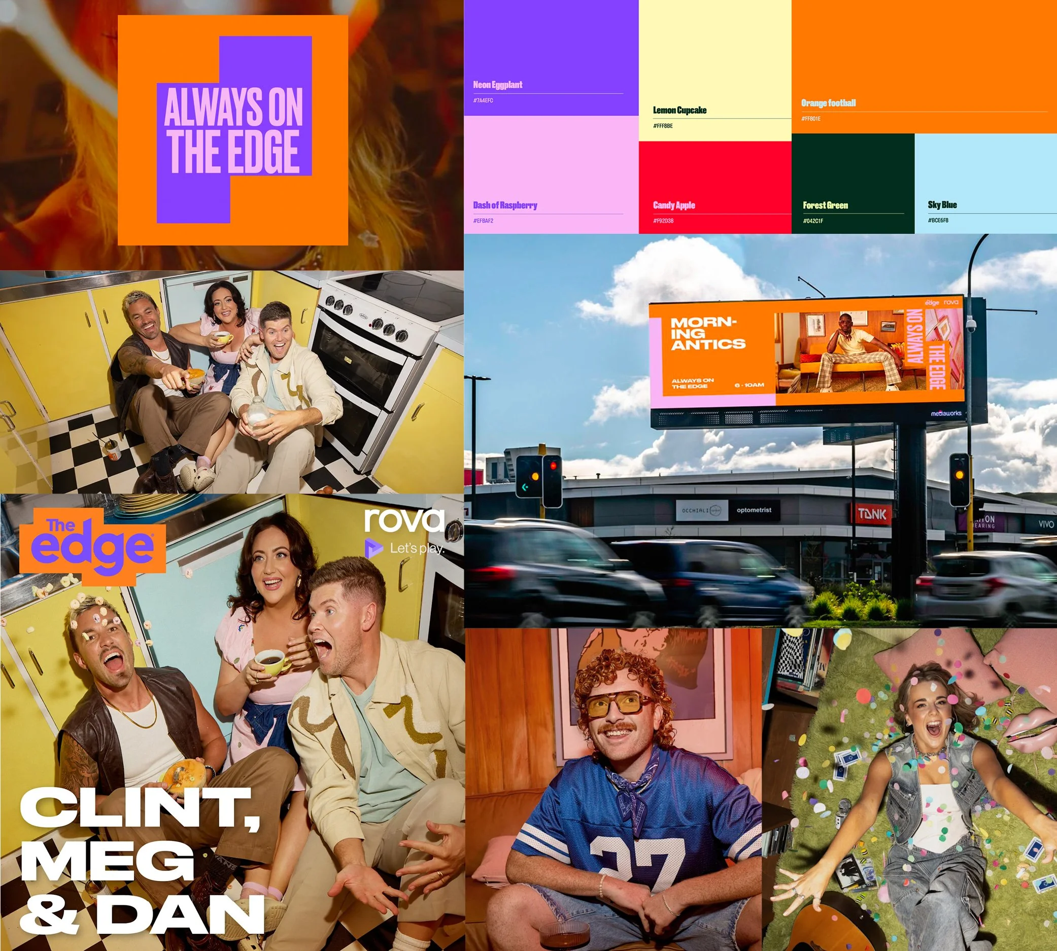
The Edge
The Edge had the audience, the music and the talent - but the brand had fragmented into a collection of disconnected campaigns that no longer felt like a coherent identity. I led a full strategic reset, developing "Always on The Edge" as the unifying platform.
The work touched everything: a new photography aesthetic that shifted from corporate headshots to editorial, narrative-driven imagery positioning talent as relatable creators; a bold new palette of Neon Eggplant, Candy Apple and Lemon Cupcake built to pop on digital and OOH; and a flexible brand device ensuring every show, competition and activation felt unmistakably The Edge. The result was a future-proofed identity that gave the station back its cultural relevance.
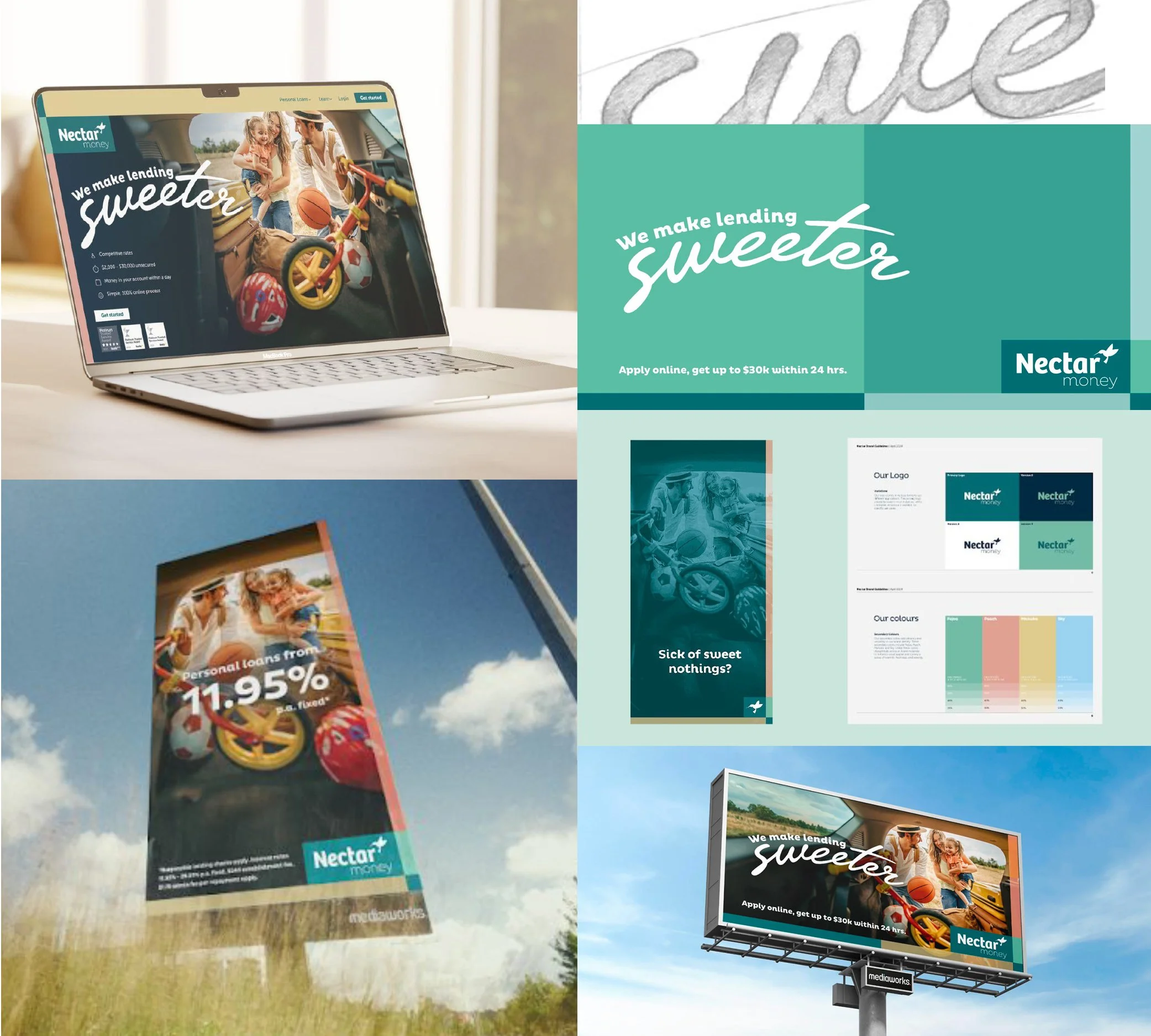
Nectar Money
In a lending category defined by "quicker, easier, faster," Nectar needed a reason to exist that actually meant something. With Kiwis feeling the financial squeeze and loan intent down 22%, the brief wasn't just to refresh a brand — it was to shift the emotional tone of an entire category.
I developed the proposition "We make lending Sweeter" and built a modernised design system around it — warmer palette, more human imagery, a brand toolkit with real depth and consistency. An emotive multi-platform campaign brought it to life through relatable, everyday moments, positioning Nectar not as a lender of last resort but as a genuinely positive force in people's lives.
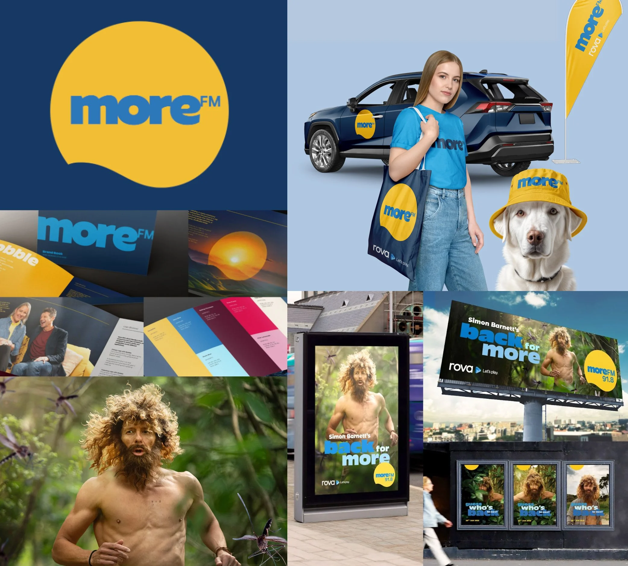
More FM
More FM was at an inflection point - new personalities, a new era, and a brand that needed to match the energy of both. Rather than treat Simon Barnett's return as a standalone campaign moment, I used it as the catalyst for a full brand overhaul, delivering a refreshed identity and a multi-platform launch simultaneously.
The logo was simplified and modernised — bolder, more contemporary, built for digital and OOH without losing what made it familiar. A new colour palette and typography kit gave the whole brand a boost. Then we launched Simon home with a "Castaway"-inspired TVC, supported across OOH, social and on-air. One cohesive moment that introduced a new-look station and a beloved personality at exactly the same time.
See the TVC here
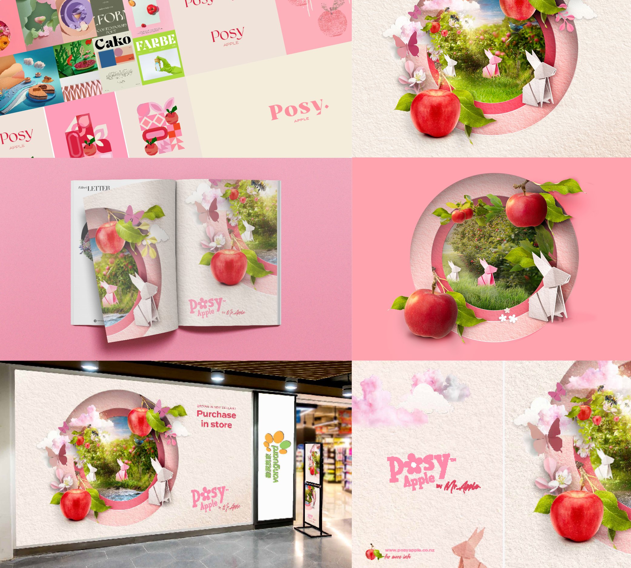
Posy Apple (by Mr Apple)
Posy is a premium apple grown for luxury export markets in Asia, where the packaging is as considered as the fruit inside. The challenge was to move it from produce to object of desire — something worth giving, worth keeping.
I developed "The Art of Craft" as the creative platform, using traditional origami and paper-cut artistry as the design language. Intricate multi-layered environments combined real fruit with delicate origami elements — rabbits, butterflies, petals — each one a nod to the meticulous care behind every Posy apple. Paired with a soft Posy Pink palette and clean, orchestrated compositions, the result was a brand identity that felt genuinely boutique and earned its place on a premium shelf anywhere in the world.
Link here to animation
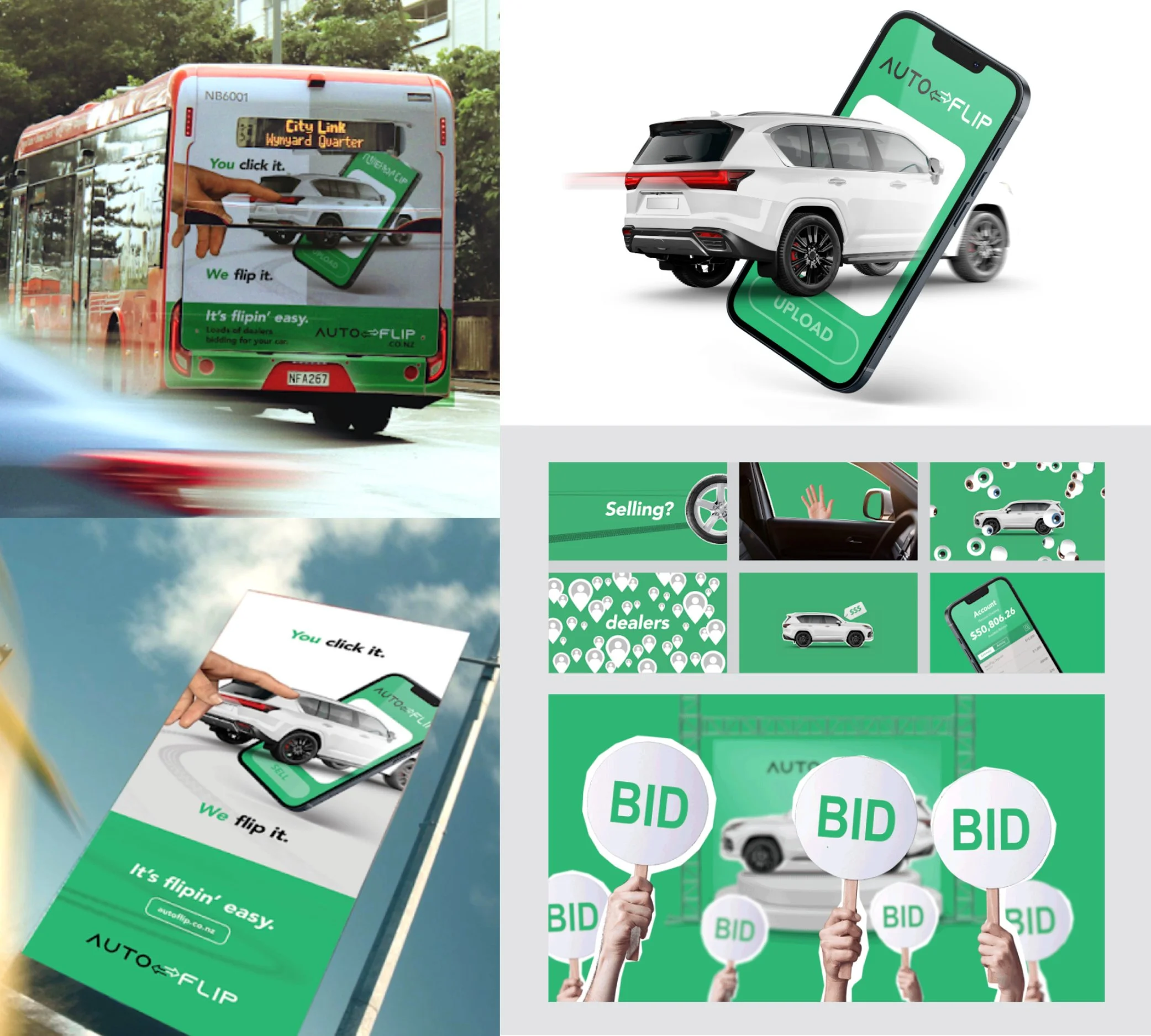
AutoFlip
AutoFlip arrived in New Zealand with a product that worked and a brand that felt Australian. My job was to give it a local voice — one that made a new digital car-selling platform feel trustworthy, approachable and unmistakably Kiwi.
I led a vibrant, high-energy campaign that made the technology feel effortless rather than intimidating. Friendly storytelling, a clear and direct visual language, and a tone that felt like a trusted local — not a tech startup from across the Tasman. The campaign successfully bridged the gap between a new digital service and consumer trust in a market that needed convincing.
‘How to’ video animation
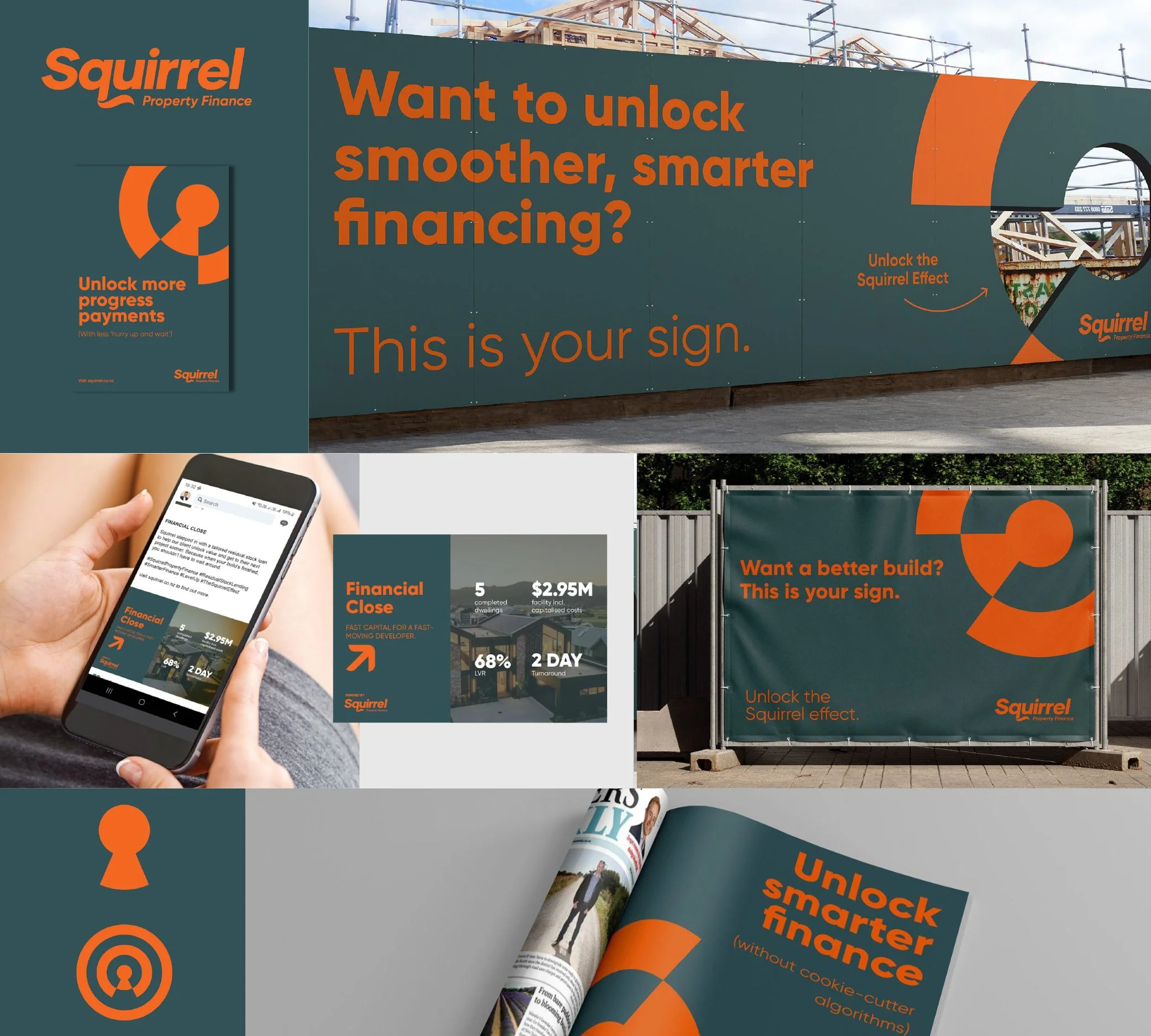
Squirrel had built real consumer love around the idea of the Squirrel Effect — small, smart financial choices that create big outcomes. The challenge was translating that into a B2B proposition that would resonate with developers, builders and investors without losing the energy that made the brand work.
"Unlock the Squirrel Effect" became the platform — nodding to the consumer line while speaking directly to a professional audience. I repositioned Squirrel as more than a lender: a complete property finance ecosystem offering smart capital, expert insight and strategic partnerships. A refined, elevated visual identity gave the brand the credibility the B2B audience needed, while keeping the distinctiveness that set Squirrel apart from every other finance brand in the category.
Squirrel Property Finance
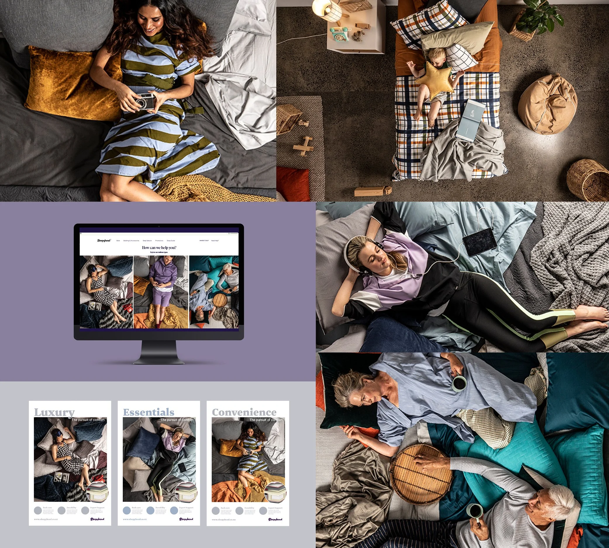
sleepyhead
The bed category had a sameness problem. Showrooms, product shots, thread counts - every brand saying the same thing in the same way. Sleepyhead had the range and the reputation to do something different, and I developed a visual world to match.
The new photography aesthetic threw out the rulebook. Shot from unexpected overhead angles, each image turns the bed into a stage -capturing real, relatable moments that celebrate different personalities, life stages and comfort styles. Aspirational but never unattainable. Playful but never frivolous. The work shifted Sleepyhead from selling a product to selling
a feeling, building the kind of brand affinity that makes people see themselves in it before they've
even walked into a store.